
San Juan Resole
The Product
A responsive website and cohesive visual brand identity for a local shoe resoling business.
project duration
2 months
My Role
Solo Product Designer & Developer (End-to-End)
My Responsibilities
-
Brand Identity + Logo Design: Created a cohesive visual brand system, including logo marks, typography scales, and color palette optimized for digital and physical touch points.
-
UI/UX Design: Conducted user research, mapped out information architecture, and designed clear user flows to simplify a complex intake process.
-
Web development: Built, optimized and launched the final responsive website using the Wix platform, ensuring seamless order form integration.
The Problem
As a newly launched, specialized business, San Juan Resole needed to establish instant market credibility and educate customers on a non-traditional service model. Because resoling requires users to navigate a complex intake process—deciding on rubber types, choosing a delivery method, and waiting for a post-inspection invoice—the business faced a high risk of user drop-off due to confusion about how the service actually worked.
The goal
Create a cohesive brand identity and an intuitive web presence that builds local trust, demystifies the repair process, and drives frictionless conversions. The primary objective was to leverage strategic FAQs and clear visual step-by-step guides to seamlessly channel users to the online intake order form, where they could confidently submit their shoes via mail-in or local drop-boxes.
Research+ Discovery
Operating on a tight timeline, I leveraged my 15 years of immersion in the outdoor community to act as a subject-matter expert. By pairing firsthand experience with targeted competitor analysis, I quickly identified the industry's primary friction points: unclear rubber specs, ambiguous turnaround times, and confusing drop-off logistics.
Competitive Analysis
-
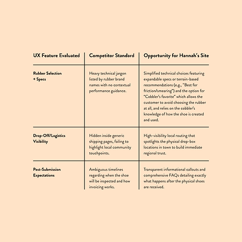
Key Finding 1: Clarity gap in technical specifications
-
Most resole websites use highly technical jargon to describe different rubber types and compounds without explaining why a customer should choose them. This creates immediate decision fatigue, particularly for recreational climbers or runners who just want the right replacement grip for their local terrain.
-
-
Key Finding 2: Friction in non-traditional logistics
-
Existing platforms often bury drop-off and mail-in shipping instructions inside dense blocks of text. Because customers must trust a business with their favorite gear before a transaction occurs, hidden logistics and ambiguous turnaround times create user hesitation and increase the risk of order abandonment.
-
USer personas
To ensure the web interface addressed the distinct motivations of our user base, I developed three user personas representing different corners of the outdoor community. Mapping these profiles allowed me to balance the needs of high-performance athletes seeking specialized custom technical gear with casual enthusiasts looking for affordable, sustainable repair options.

Marcus, 28 | High-Performance customizer
Marcus lives for speed and marginal gains. He has a highly specific race coming up on loose, technical terrain and wants to fuse his favorite, lightweight road-running uppers with a high-friction Vibram Megagrip trail sole. He is incredibly tech-savvy, hyper-focused on gear specs, and willing to pay a premium for a rare, high-performance European sole that San Juan Resole is uniquely stocked to provide.
Design Focus: Technical accuracy, precise rubber spec breakdowns, and clear customization fields in the submission flow.
Quote:
"I know exactly what shoe and sole my next race demands. I just need a cobbler that lets me specify my custom requirements without gating it behind a generic contact form."

Elena, 45 | Sustainability enthusiast
Elena runs to disconnect and stay active. She has an ancient pair of trail runners that are perfectly broken-in and feel like slippers, but the tread is completely bald after logging 1,000 miles. She hates the consumer cycle of throwing away gear that still has life in it. Her primary barrier is unfamiliarity with the resoling process; she needs straightforward assurance that her beloved running shoes can actually be saved and won't get lost in transit.
Design Focus: Clear, jargon-free step-by-step guides, reassurance on structural integrity, and an intuitive layout that feels approachable to beginners.
Quote:
"These shoes have survived three ultramarathons and fit my feet perfectly. I don’t want to buy a new, stiffer model—I just want to extend the life of the gear that already works for me."

Cole, 34 | Dedicated local climber
Cole is a seasoned climber who burns through sticky rubber every few months. He is highly protective of his gear and fully understands how a bad resole can ruin the downturn of a precise climbing shoe. With the cost of brand-new climbing shoes skyrocketing, he wants to support a local business in town rather than dealing with the high shipping costs and 8-week wait times of massive national mail-in cobblers.
Design Focus: Transparent local drop-box logistics, explicit turnaround times, and immediate visual validation of the craft's quality to build regional credibility.
Quote:
"Having a reliable cobbler right here in town is a game-changer. I save money, avoid the massive wait times of big mail-in shops, and keep my favorite broken-in send shoes alive."
Information architecture + Site Map
Because San Juan Resole operates on a service-intake model rather than a traditional e-commerce system, organizing the information architecture was critical to preventing user drop-off. I designed a streamlined sitemap and a friction-free user flow to guide customers effortlessly from initial technical education straight to the order submission form.

A lean, flat navigation structure designed to give users immediate access to pricing, technical specs, and logistics.

A linear path guiding users from initial brand education and FAQs directly to order form submission.
From Wireframes to High-Fidelity design
With the structural framework established, I shaped a vibrant visual identity that captures the funky, counter-culture energy of 90s surf and climbing aesthetics. Infusing the design with rich, deep tones that reflect the landscapes surrounding Durango, Colorado, I balanced a playful, passionate retro ethos with clean layout architecture to keep the interface highly functional yet unmistakably unique.
Digital Wireframes
My primary goal during the wireframing phase was to map out a clear content hierarchy that immediately addresses customer hesitation and simplifies the service-intake process. I focused on designing highly scannable mobile layouts that weave our funky, 90s-climbing-culture ethos directly into functional information buckets, ensuring technical details never feel overwhelming.
Mobile homepage:
Places the most critical logistics at the absolute forefront, using bold, retro-blocked layouts just below the fold to instantly display current turnaround times, mail-in welcoming text, and clear drop-box locations. The primary call-to-actions (CTAs) for the service options and the digital Order Form are heavily emphasized in the immediate viewable area to drive seamless conversions.
Mobile product page:
Swaps dense text grids for a highly visual, side-by-side comparison gallery that shows users exactly when a shoe is primed for a resole versus when it is past the point of saving. By leaning on straightforward visual cues rather than heavy jargon, this educational page demystified the process for users and included a persistent 'Order Form' CTA at the bottom of the matrix to capture motivated customers immediately.

Mobile homepage
When to Resole? page
Visual Identity + Design System
To truly capture the spirit of San Juan Resole, I bypassed sterile, modern corporate aesthetics in favor of a vibrant, funky visual identity rooted in 90s surf and climbing culture. Built around custom hand-lettered logo marks and a deep, rich color palette that reflects the rugged mountains and high deserts surrounding Durango, Colorado, this design system balances a playful, passionate counter-culture ethos with structured UI components to keep the experience authentic yet effortless to navigate.

High-Fidelity Prototypes
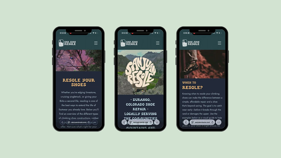
By pairing bold brand tones and custom hand-lettered elements with a structured typography scale, I transformed the foundational wireframes into a polished, responsive digital experience. This final interface highlights optimized mobile layouts, fluid interactive components, and a visually driven educational flow built to elevate user trust, celebrate Durango’s outdoor culture, and maximize service-intake conversions.
Accessibility considerations
-
PLAIN LANGUAGE + CLEAR INFORMATION HIERARCHY
To ensure the platform remains welcoming to casual runners and beginners, I stripped away confusing cobbler jargon and flattened the site architecture. Technical rubber terms are always paired with simple, functional context (e.g., "Max Grip" vs "Max Durability"), and the visual layout guides users through the submission process in an intuitive, step-by-step manner.
2. High-Contrast Retro Color Mapping
While leaning into a bold, funky 90s palette inspired by the alpine, I strictly mapped text and interactive elements to ensure they exceed WCAG AA contrast ratios. Background color blocks and custom hand-lettered accents were paired intentionally with deep, high-contrast typography to maintain absolute readability for low-vision users without sacrificing the brand's vibrant personality.
Final Takeaways
Impact + Business success
Since launching in early 2026, San Juan Resole has enjoyed a steady stream of consistent business and a rapidly growing community of highly satisfied customers. By successfully establishing an approachable digital storefront, the website has effectively funneled local and regional outdoor enthusiasts into the brand's unique service-intake ecosystem, securing a strong initial foothold in the outdoor gear repair market.
Lessons learned + Continuous Iteration
-
The Reality of Service-Intake Complexity: Even when aiming for maximum simplicity in the initial wireframes, real-world deployment revealed that a segment of users still experienced friction trying to fully grasp the multi-step intake and drop-off process.
-
Designing with Real-World Feedback: Rather than leaving the interface static, we actively listened to customer pain points during the first few months of business. I analyzed user behaviors and iteratively restructured the microcopy and informational headers to guide customers even more clearly. This proved that a successful UX design is never truly finished at launch—it evolves alongside its community.
Client Testimonial
"San Juan Resole is a humble but passion-driven business and I really wanted branding and a site that exemplified that. Kass was able to create a logo for me quickly that connects my business to the community by tying in an iconic landscape piece that people within the community resonate with. I get complimented on it all the time. It allows me to create stickers and other items that people are excited to share and show support for the business. My website is straightforward and allows customers to navigate through the process of submitting orders and getting connected with me. I am thankful for the result and happy with the continued support that Kass has provided."
— Scott Vinsel, Owner and Head Cobbler at San Juan Resole